COLOR OR DRAWING COMES FIRST?
Like I said in the previous exposition, even though we can’t tonally verbalize a DESATURATED COLOR or NEUTRAL GREY, it doesn’t stop being a color, so it can’t be named non-color or a-chromatic index. Non-chromaticity or a-chromaticity manifests at the level of relation between colors in mono-tonal, a-tonal, desaturation, and polarized values conditions.
It is confirmed even by the painter Theodor Palllady in one of his letters as a response to his friend, the French painter Henri Matisse. He suggests that „we can paint even without using colors”-saturated and tonally verbalized. In the exchange of letters between the two painters in the 40s of the past century, they tried to solve a dispute initiated by the artists of the French Royal Academy of Painting in 16th century on the theme of COLOR versus DRAWING priority. The attempt of Charles Le Brun to solve it by assigning COLOR to the eye and DRAWING to the mind failed at the moment, even if it was not so far from the truth - only had the wrong attitude by obviously favoring the DRAWING at the expense of COLOR.
Neither the two modern artists arrived at some consensual resolution, placing themselves in opposition, even three centuries after the initial dispute.
Henry Matisse claimed the priority of COLOR because, in his view, it may determine the quantity or area of the surface in a compositional context. It is why their outline, decided by DRAWING, follows the choice of COLOR. On the other hand, Theodor Pallady claims the priority of DRAWING from a lucrative point of view because it influences the choice of COLORS. They can emphasize, by contrast, or fade, by chromatic closeness, the organization of surface directions and positions.
To find the solution we have to detach ourselves a little from the artist’s constructive and lucrative arguments and conceive the ways of working with COLOR and DRAWING in the reductive perspective of compositional MORFO-ATTENTIVE TOPOLOGY: the MORPHOLOGICAL REDUCTION.
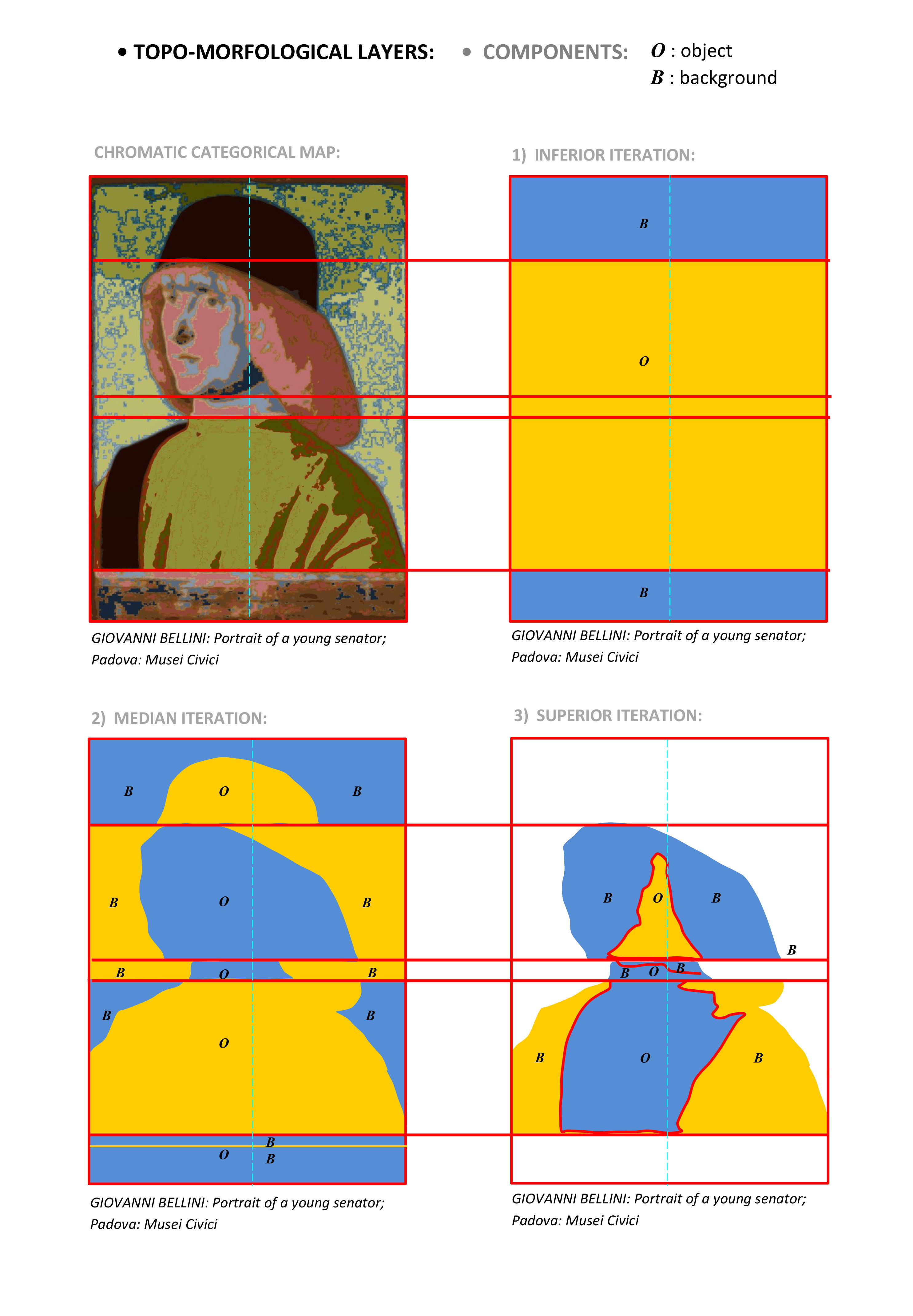
I will not clarify here the need for compositional TOPOLOGY rather than GEOMETRY. Still, I have to specify that the constructive goal of ATTENTIVE TOPOLOGY is the visual-perceptive effect of the surface’s topological SYMMETRIZATION inside morphological registers or FORM. This effect leads to the attentive prominence of the topological „axle” of SYMMETRIZATION, with OBJECT status, and attentive overlooking of lateral surfaces, with BACKGROUND status.
The ATTENTIVE TOPOLOGY can be addressed as CHROMATIC TOPOLOGY within the working way of COLOR and A-CHROMATIC TOPOLOGY within the working mode of DRAWING. Each type of topology has its means to access SYMMETRIZATION and FORM. Understanding this will help us establish not as much the priority of one or another way of working but especially the means to relate the properties to achieve the common purpose of their ATTENTIVE TOPOLOGY.
As an application, in this exposition, we will tackle just the CHROMATIC TOPOLOGY of COLOR way of working, based on tonal relations in categorical conditions of variation or constancy of value and saturation or isoluminant colors. We will establish the correspondence between them within the CHROMATIC FINGERPRINT of the image of a historically consecrated work of painting: Portrait of a young senator by Giovanni Bellini found at Musei Civici from Padova.
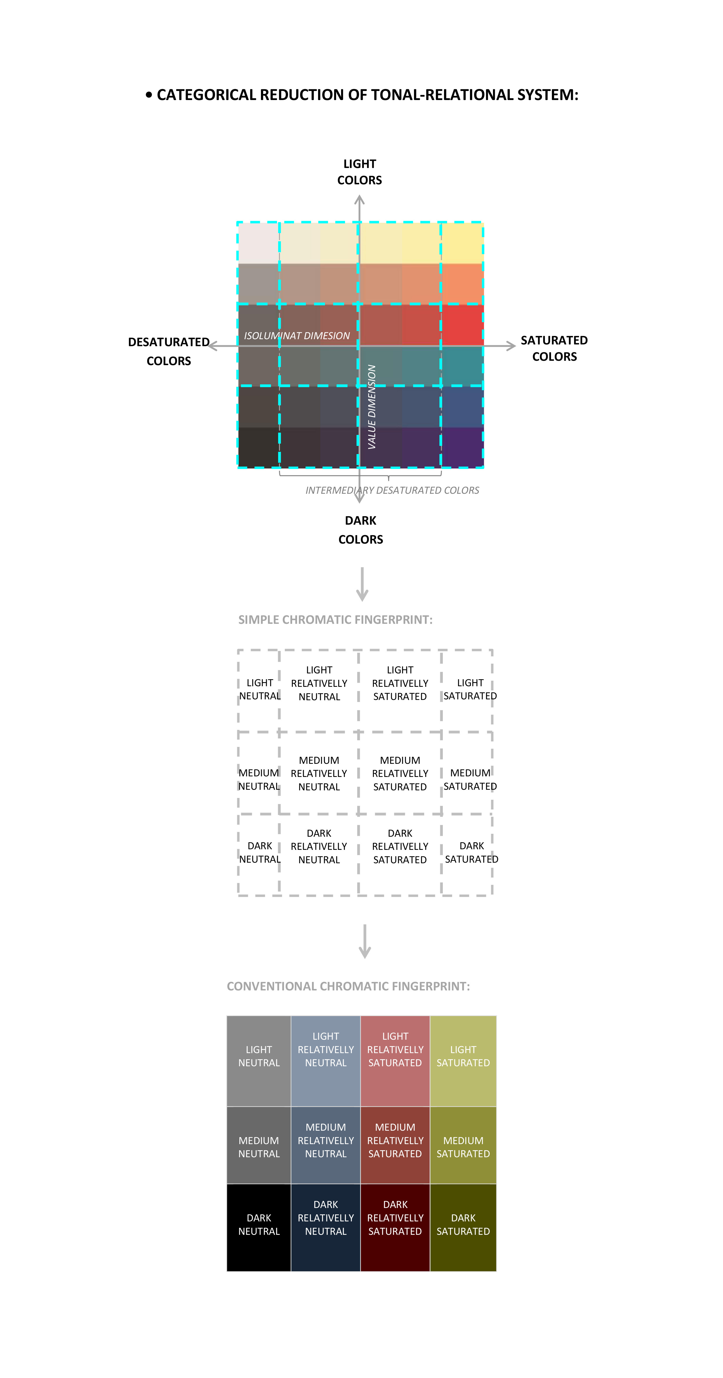
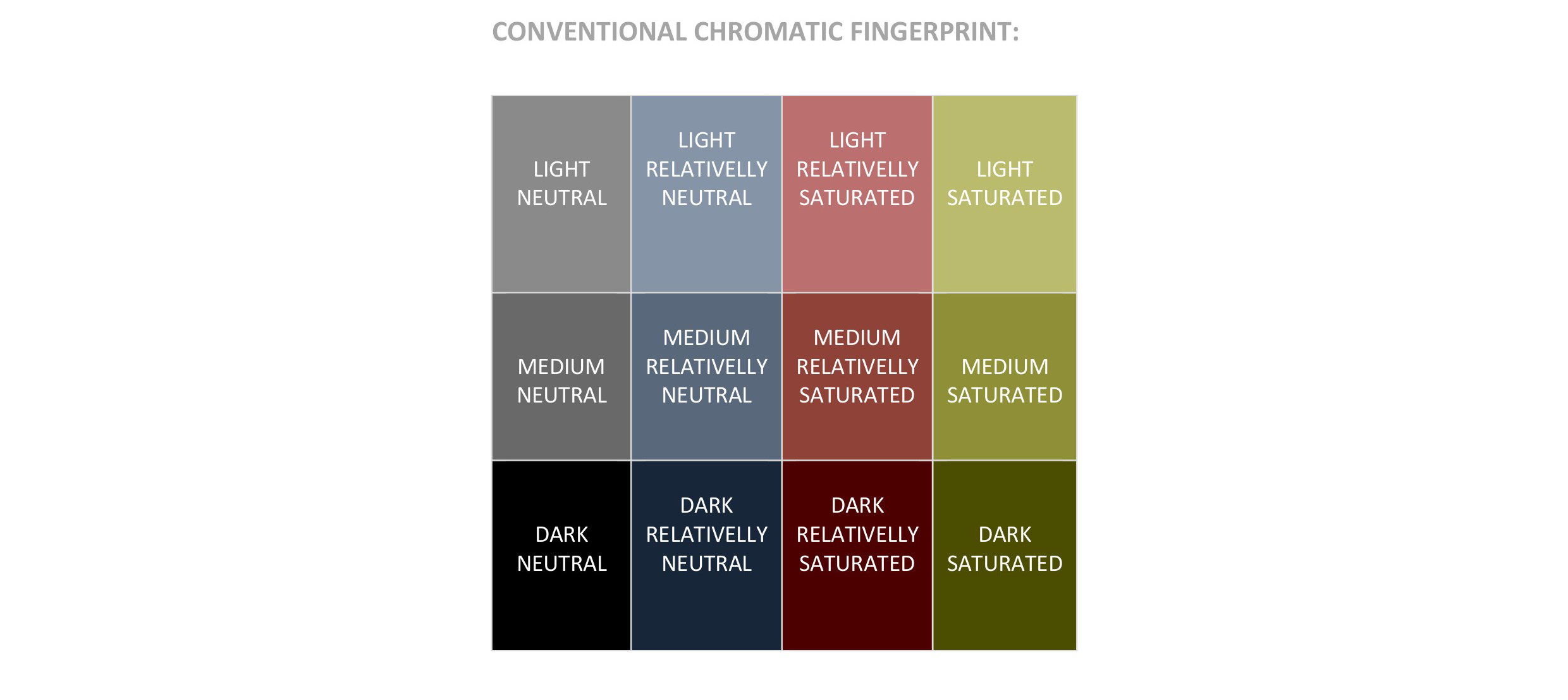
THE CHROMATIC FINGERPRINT acts like a reductive categorical compass of the CHROMATIC TOPOLOGY of works of visual art. Its use shows that THE CHROMATIC CATEGORICAL SYSTEM is a model of compositional research adapted to the structural-chromatic uniqueness of every researched work of visual art.
The SYSTEM OF CHROMATIC MIXING, rendered by the model of COLOR SPHERE and CIRCLE, can’t be adapted to the uniqueness of visual artworks but only to their reproduction by the production of multiple and replicable chromatic indexes. The mixing develops as gradients between combinations of chromatic indexes or identities. They follow the cognitive need of stimulus ranking by the sensorial threshold, summarized by the laws of Weber, Weber-Fechner, and Stevens, with their formula, in the psychophysical theory. Its exponential or logarithmic character implies the link between threshold sensation, spatially contextualized as gradient development and the population of retinal cells that activate it by receiving activity.
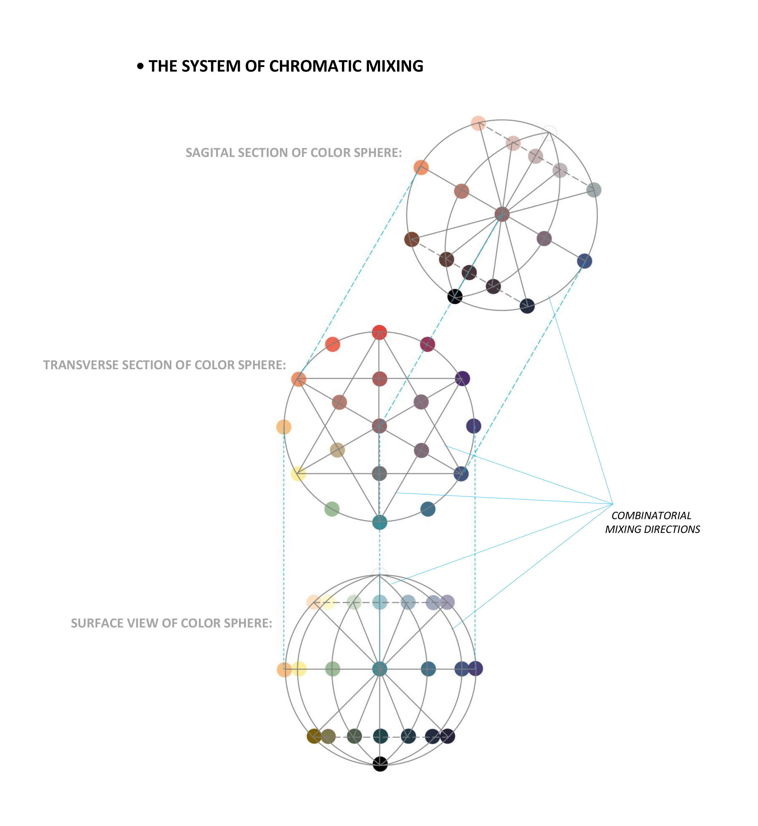
The CHROMATIC TOPOLOGY involves a selective compositional correspondence between chromatic categories and mixing so that the mixing is present in some categories (TOPO-CHROMATIC VARIATION) and absent in others (TOPO-CHROMATIC CONSTANCY).
The main chromatic categories of CHROMATIC FINGERPRINT subtracted from the RELATIONAL and CATEGORIAL SYSTEM are:
1) LIGHT COLORS;
2) DARK COLORS;
3) SATURATED COLORS;
4) NEUTRAL COLORS.
Between LIGHT and DARK, there is the AVERAGE COLORS category, and between SATURATED and NEUTRAL, there is the INTERMEDIARY COLORS category divided between RELATIVELY SATURATED and relatively NEUTRAL. We assign the term AVERAGE to the middle of the VALUE DIMENSION and the term INTERMEDIARY to the middle of the ISOLUMINANT DIMENSION.
The reduced chromatic system that results consists of:
• 3 rows that include the following categories of colors: LIGHT SATURATED, MEDIUM SATURATED, DARK SATURATED;
• 3 columns that include the following categories of colors: SATURATED, RELATIVELY SATURATED, RELATIVELY NEUTRAL, and NEUTRAL, all presenting vertical variations of value.
To start, I will explicitly present the deduction of categories by samples of color convergent in the system of CHROMATIC FINGERPRINT. The result will be the CHROMATIC CATEGORIAL MAP of the image of the analyzed work.
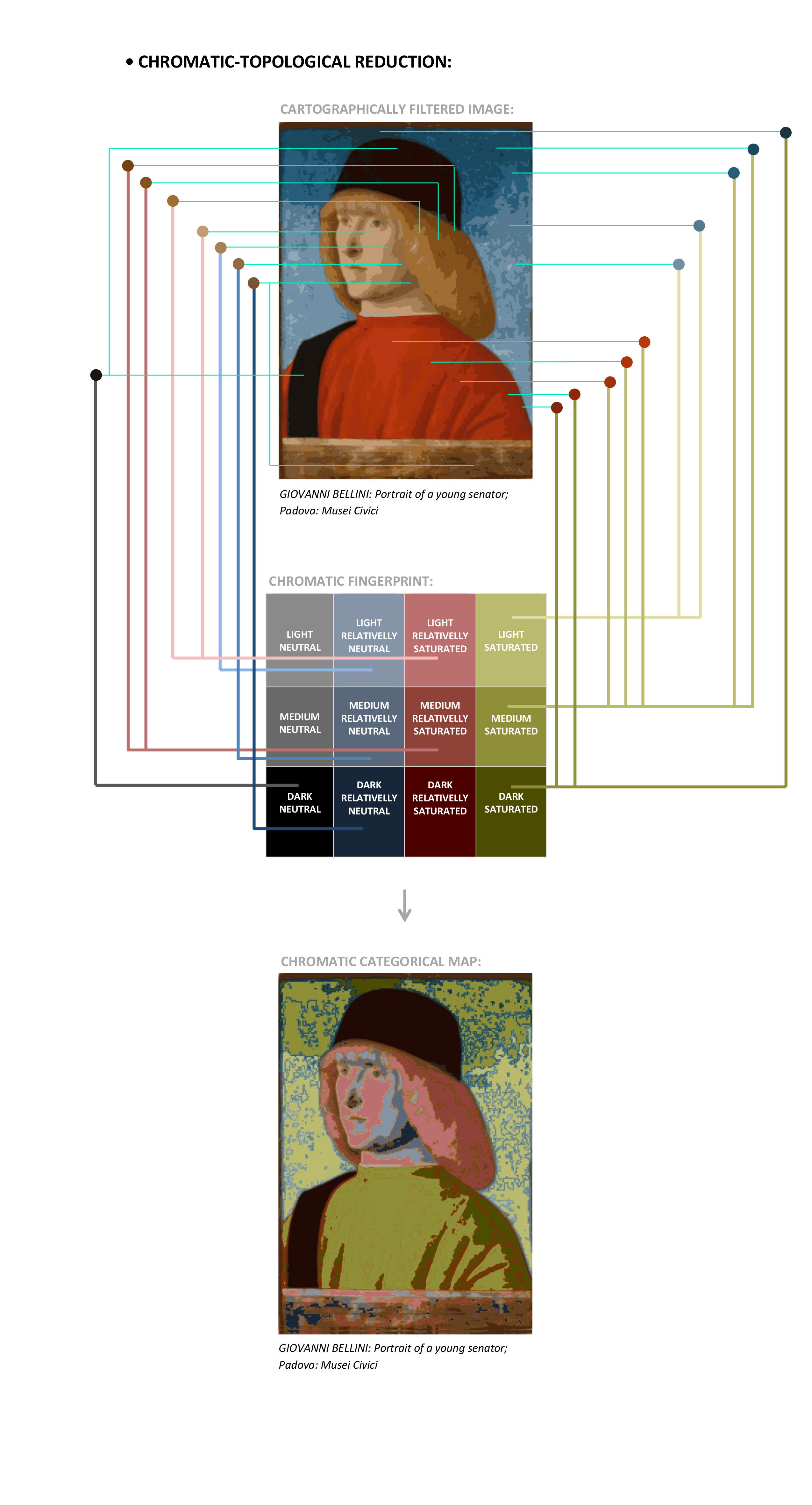
The analysis of Giovanni Bellini’s work shows us that:
• Values alteration of SATURATED COLORS, of red-orange and blue tones on the dominant and lateral surfaces;
• The desaturative alteration of yellow and orange on the recessive and central surface, but also the inferior edge;
• Generally, we observe an association between tones and chromatic categories so that: LIGHT COLORS correspond to blue tones, MEDIUM COLORS correspond to red-orange tones, INTERMEDIARY COLORS, RELATVELLY SATURATED AND RELATIVELY NEUTRAL, are associated with orange, respectively yellow ones, and DARK and NEUTRAL COLORS correspond to green tone (deduced in the simultaneous context in opposition with red-orange tone).
This way, we can motivate the term „spectral palette” assigned by Adriana Botez Crainic to Venetian painters of the 15th and 16Ith centuries in his manuals of art history.
The MAP OF CHROMATIC TOPOLOGY explains the position and constructive grouping of surfaces to achieve the morphological registers based on visual attention due to the tonal-chromatic relationship of the surface’s content. A presentation of structural construction and morphological organization in the context of non-chromatic relations, specific to the DRAWING mode, will be made in a future exposition.
The chromatic development of the COLOR PALETTE depends mainly on RECEIVER and sensorial LEVEL. This chromatic and lucrative model can’t respond on its own to the needs of the spatial organization of colored compositional surfaces. The CHROMATIC TOPOLOGY relates the development of possible gradients of mixtures to reduced chromatic categories resulting in CHROMATIC CONSENSUS at the cognitive level of visual positioning. They imply an alternation between the tendency of TOPO-CHROMATIC VARIATION and CONSTANCY by mixing and gradients within categories to stop „chromatic redundancy” by uncontrolled diversification in all possible categorical directions. Also, these categories show us by SYMMETRIC spatial distribution the morphological status of OBJECT or BACKGROUND of surfaces grouped and layered in MORPHOLOGICAL REGISTERS and ITERATIONS.
In conclusion, the COLOR way of working is based on specific relational CHROMATIC CONSENSUS between properties of compositional surfaces as follows:
• CHROMATIC CONSENSUS is established between chromatic categories and spectral tones. I will not offer here a general formula of relations between those in the system of CHROMATIC FINGERPRINT. I will return to this topic in future applications;
• By COLOR, we directly solve the DYNAMICS of compositional surfaces, just by the symmetric positioning of colors of the surface’s content within MORPHOLOGICAL REGISTERS.